Internet access is an essential lifeline to learn, work, access public services and fully participate in today’s society. But for many American households, broadband internet is still too expensive, too slow and out of reach.
In 2022, The Markup’s Aaron Sankin, Investigative Reporter, and Leon Yin, Investigative Data Journalist, embarked on a months-long investigation that revealed the country’s poorest neighborhoods disproportionately pay higher prices for slower internet. The resulting project, Still Loading, was a winner in the Excellence in Technology Reporting category in 2023 Online Journalism Awards.
More than a dozen other newsrooms have applied guidance and data from The Markup to investigate internet pricing disparities in their own area, including in cities like Seattle and Portland (InvestigateWest), Detroit (Outlier Media), Minneapolis (Sahan Journal) and others. Among several resources, the team built tools to help people search for better deals on broadband internet and partnered with Consumer Reports for wide distribution of the comparison-shopping guide. Most recently, The Markup partnered with Capital B to amplify the stories of Black Americans in the rural South who still have no or limited options to access high-speed internet.
We wanted to learn more about the elements that raised this project to award-winning status. Aaron generously shared about what motivated the initial investigation, lessons for other journalists and the kind of impact that technology reporting like this can create for communities.
“Still Loading” came on the heels of another Markup investigation looking into a predictive policing algorithm that disproportionately directed officers to patrol marginalized neighborhoods. That policing algorithm story was all about the lingering reverberations of America’s long history of race-based housing segregation. If certain neighborhoods were more likely to be subjected to increased police patrols, we wondered, could the deals offered by internet service providers (ISPs) also be distributed inequitably?
Our project began with a data collection method. Three years before The Markup’s investigation, a team of researchers at Princeton published a study that used data scraped from the websites of ISPs to show how a nationwide map of broadband connectivity maintained by the Federal Communications Commission had widespread, systematic inaccuracies. Once we heard about this way to gather connectivity data, we realized we could use it to map other elements of the digital divide.
Prior to using this scraping method to collect data directly from ISP websites, there was no publicly accessible way to determine what level of connectivity was offered to U.S. households at the address level. At the time, the FCC’s map only showed the highest level of connectivity offered within each Census block.
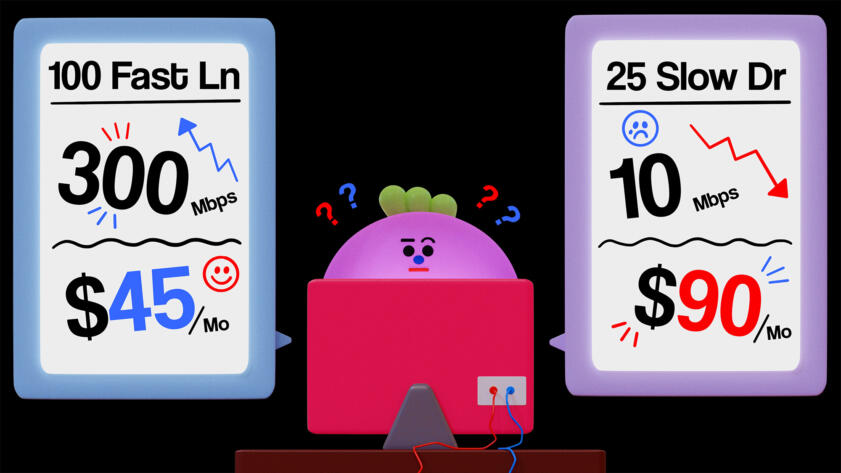
Once we built scrapers and reviewed our initial data, we quickly realized that connectivity varied dramatically from one house to the next, and furthermore, one household’s sluggish connection was frequently offered for the same price as their neighbor’s fast one.
These realizations suggested a hypothesis that we spent the better part of a year working to prove: that ISPs were offering disproportionately significantly worse deals to parts of cities that were less White, lower income, and historically redlined.
“Reporting on the digital divide for this story revealed to us that the reason why certain areas in major cities had better internet service than others was largely about where ISPs decided to upgrade their networks.”
Outside of our initial investigation, almost all the work we’ve done in the “Still Loading” series is aimed at empowering others to take our story one step further.
For distribution, we partnered with Consumer Reports to get this comparison-shopping guide in front of their civic-minded, price-conscious readership (hundreds of their readers have followed the guide), and we partnered with the Detroit Documenters, who found and reported errors in the FCC map minutes after they started.
The lesson here is that publishing an investigation can be a jumping-off point for a larger project. We could make the methods we developed during the investigation accessible for readers to use themselves.
Reporting on the digital divide for this story revealed to us that the reason why certain areas in major cities had better internet service than others was largely about where ISPs decided to upgrade their networks. In certain areas, they had invested in the technology necessary to provide state-of-the-art connections, whereas others were stuck with decades-old technology.
Our investigation was, in effect, working to make a map of ISPs’ infrastructure based on the speeds they were offering at each address. It gave us a hazy picture of where ISPs were laying their newest infrastructure, but our view was far from complete.
The FCC recently proposed a new requirement that ISPs file documents showing where they are upgrading their systems. This dataset, once it is made publicly available, will provide a new opportunity to hold ISPs accountable if their new technology deployments are upholding the digital divide rather than attempting to bridge it.
Lighthouse Reports and WIRED’s Suspicion Machines project is a great example of exposing an otherwise black-box system to accountability. It explained the effects of a fraud-detection algorithm by learning how the system worked and then feeding synthetic people into it to see how each of them was scored. The piece did a great job of making an otherwise complex, and potentially dry, issue visceral and accessible.
Grist’s Ghosts of Polluters Past** investigation into toxic lead contamination in Santa Ana, California is also a deeply inspiring piece of journalism. Not only did reporter Yvette Cabrera hand-collect over 1,600 soil samples from across the city, but she was also able to directly tie modern-day environmental pollution to zoning decisions and racially-restrictive deed covenants made near a century ago that funneled the city’s minority population into the most toxic neighborhoods. It’s always great to see journalists building datasets themselves by physically going out into the world and gathering data.
** Ghosts of Polluters Past was a finalist for the Knight Award for Public Service in the 2022 Online Journalism Awards. Get to know other honorees in this category.
Launched in 2000, the Online Journalism Awards are the only comprehensive set of journalism prizes honoring excellence and innovation in digital journalism around the world. The call for entries for the 2024 awards is open April 4–May 9.
Explore the 2023 winners and finalists Volunteer with the OJAs
Posted By
Karolle Rabarison
Categories
Stories