The coronavirus pandemic has forced us to act during a time of tremendous uncertainty. At the beginning, little was known about the virus itself or how it was moving around the world. We didn’t know who was dying or why. We didn’t know what we should do.
Our visual stories filled in the gaps for readers at crucial moments by painstakingly uncovering new information and presenting it as a thoughtful mix of words and graphics.
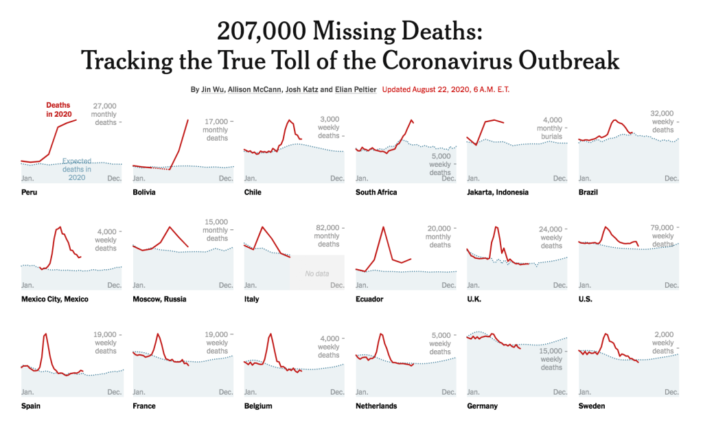
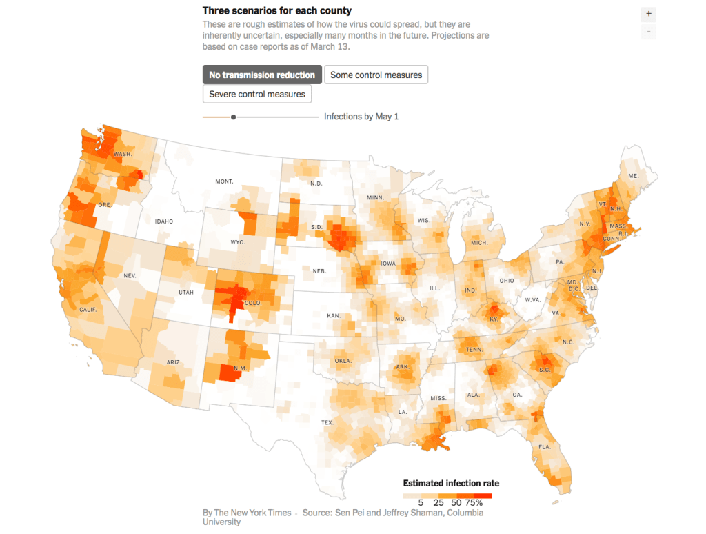
Each piece involved tireless original reporting, and required painstaking work to find data far beyond what was available from official sources. Graphics were central explanatory elements of the work, leveraging the internet’s full potential to help people understand such a vast story. And each story drew impassioned responses from patients, family members and officials.
Our memorial to 1,000 Americans who lost their lives to the coronavirus provoked an outpouring of empathy and became an emblem of our collective grief.