
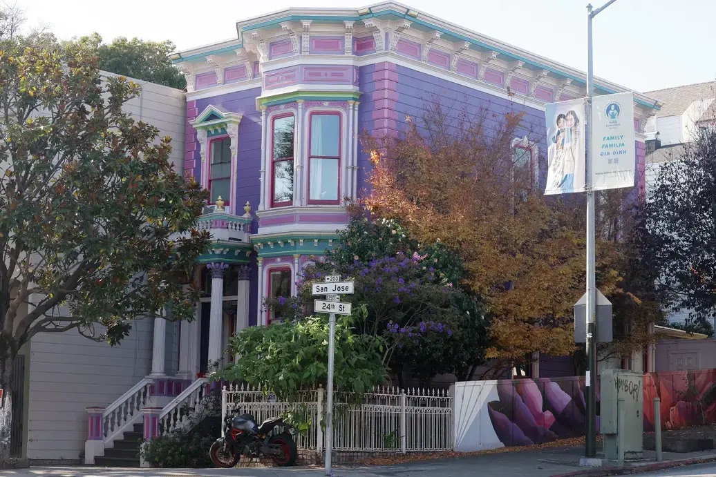
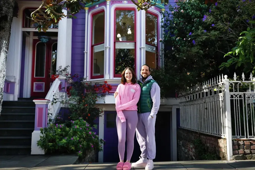
San Francisco is known for its colorful homes, ornate Victorians in seven-color palettes, boxy bungalows in sherbert tones and stately Edwardians with beckoning bay windows. The houses have been featured in guidebooks, on postcards and, famously, in the “Full House” opening credits. They’re a beloved part of the city’s aesthetic and a symbol of its culture of tolerance, creativity and freedom of expression.
But despite the homes’ iconic status, there’s been little documentation of their density or distribution. Which is San Francisco’s most colorful neighborhood? What is the city’s most popular shade? We realized nobody actually knew.
To answer those questions, Hearst Newspapers DevHub Director of Newsroom Engineering Evan Wagstaff built a custom AI tool to scrape Google Street View images for residential properties and find the dominant color of each address. After filtering out poor images and results with low confidence scores, we were left with a dataset of 115,000 homes.
Chronicle Data Visualization Developer Nami Sumida analyzed that data to deliver a novel understanding of San Francisco’s visual identity. She found the city’s most prevalent color (blue), its most colorful neighborhood (Bernal Heights), the vast array of shades on local homes (16,200 different colors!) and a statistic that surprised us: only 32% of the city’s houses qualify as colorful. (That’s still more than two other cities we analyzed: Houston and Hartford.)
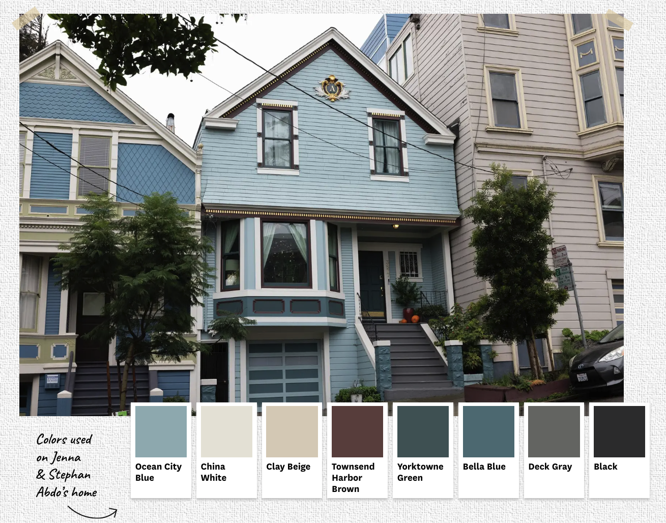
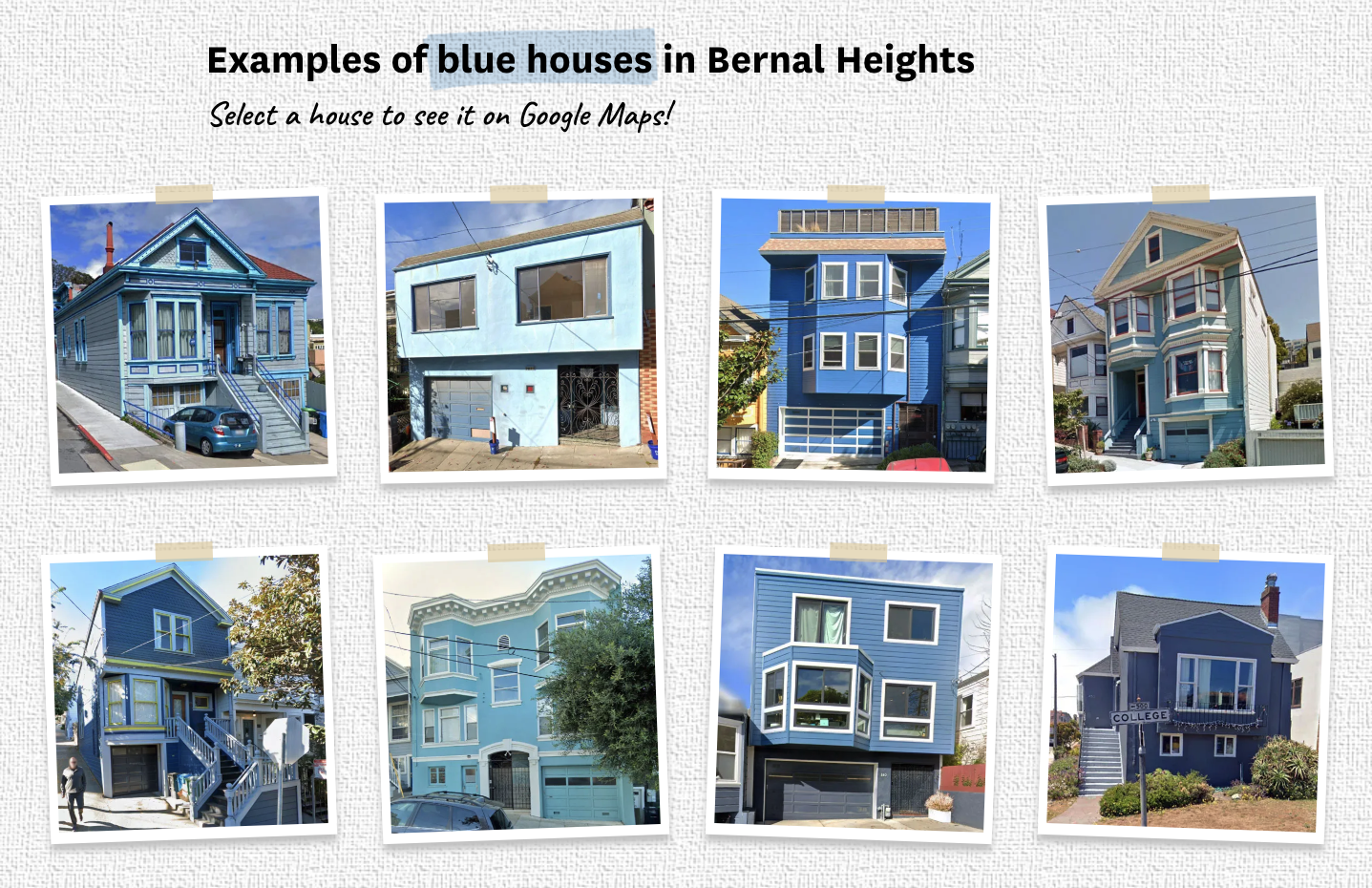
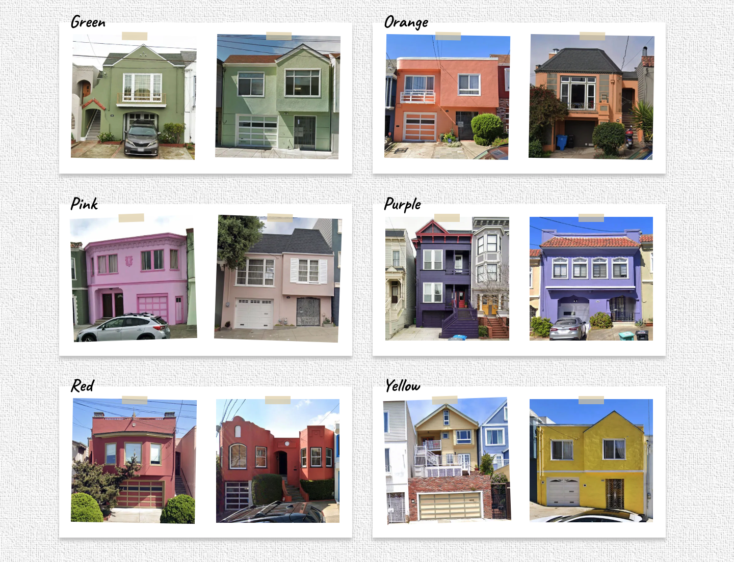
To immerse readers in the residential rainbow, Sumida built custom graphics and animations. Google Street View images offered examples of vibrant facades pulled straight from the project’s data source, paint swatches spotlighted the kaleidoscopic variety, and an 8-shade palette overlaid on one Noe Valley home showed how complex color combinations can create a cohesive look (with a 23.75-karat gold leaf accent, of course).
Animated brush strokes painted selected text throughout the story in corresponding shades, and drone video and a side-scrolling panorama by graphics intern Jade Wang transported the reader to the city’s most colorful block, as if they were huffing and puffing past the vivid houses on steep Manchester Street.
To understand the origins of San Francisco’s colorful homes and their impact on residents, Chronicle Editor of Emerging Product Sarah Feldberg spoke to house painters, an architecture professor and the city’s foremost colorist, who estimates he’s worked on 18,000 local homes. She also interviewed homeowners, knocking on doors to hear how residents relate to the city’s culture of color and what it feels like to live inside a piece of it.
The design and voices of the story carried over to its social media rollout. A video by multimedia journalist Sarah McGrew used Sumida’s graphics to translate the project to a social audience while sharing the voices of real people living in San Francisco’s colorful homes.
The response to the story has largely been delight and appreciation. At a time when news can feel dominated by conflict, Chronicle readers appreciate fresh insight into their urban landscape and a moment to stop and see the colors all around them.